
Can you say 'width'?
flex-basis
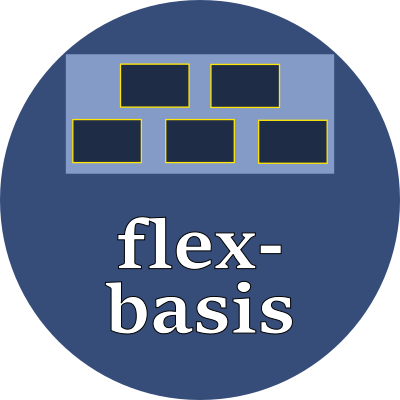
The flex-basis property is the desired size of an element before it grows or shrinks to fit within its container.
Property values
This property is meaningful only on elements that are directly within a flexbox container. It can be thought of as being synonymous with the element's original width or height, before the container's grow/shrink algorithm adjusts its size.
When the element's container has flex-direction:column, this property affects its width. When the element's container has flex-direction:row, this property affects its height.
Specify this value as one of these keywords:
Keywords:
| content | Automatically size according to the element's content |
| min-content | The smallest size where the contents won't overflow |
| max-content | The largest size where the contents fit perfectly, with no unused space |
| fit-content(size) | The given size, but never more than max-content and never less than min-content |
Or use any of these font-relative typographic units:
| em | em | The font-size of the current font |
| rem | relative em | The font-size of the <html> element |
| lh | line height | The line-height of the current font |
| rlh | relative line height | The line-height of the <html> element |
| cap | cap height | The nominal height of the current font's capital letters |
| ex | "x" | The height of the current font's "x" glyph |
| ch | "0" | The advance measure (the width) of the current font's "0" glyph |
| ic | ideograph count | The advance measure (the width) of the current font's "水" ideograph |
Or use any of these fixed size units which are independent of the current font:
| in | inch | A size equal 96px |
| px | pixels | A size equal to 1/96 inch |
| pt | point | A size equal 1in/72 = 1.33px |
| pc | pica | A size equal 1in/6 = 12pt = 16px |
| cm | centimeter | A size equal to 96px/2.54 = 37.8px |
| mm | millimeter | A size equal to 96px/25.4 = 3.8px |
| Q | quarter millimeter | A size equal to 96px/1016 = 0.94px |
Examples
flex-basis: 14rem;